


Malcolm (ESA), Noordwijk, NL, 27 April
I thought I would dedicate today’s entry to data processing. Data processing is the often the overlooked aspect of campaigns. Long after the excitement of the aircraft taking to the skies, the satellite passing over top and the breath-taking views of polar regions, the actual processing of the large volumes of data collected during a typical campaign require time, skill and dedication. Nonetheless, the key to the success of any campaign lies in the skilled processing and interpretation of the data, and the new insight and scientific results it brings.
CryoVex campaign results from 2 April 2012
So, today I’m pleased to show some very first results from 2 April 2sea-ice campaign. All credit should go to my ESA colleagues Marco Fornari and Thomas Armitage, and Henriette Skourup from DTU who made it possible. Marco for instance was able to wade into the huge stream of data CryoSat produces each day, pluck out precisely the orbit on 2 April over the Arctic Ocean, which was underflown both by ESA and NASA aircraft. Using his expertise and favourite laptop he then processed the raw data, turning the numbers into meaningful information such as radar echo shapes and distance estimates.

CryoSat radar echoes
Enter Henriette from DTU, a steadfast member of the campaign team, who performed similar processing feats with the airborne laser data collected from her plane on that day. The final steps, putting everything together were done by Thomas, who skilfully combined measurements from CryoSat taken from 700 km above Earth with those from the airborne instruments taken only a few hundred meters above the ice – providing us with a first and most intriguing insight into some of the basic science questions surrounding the mission.
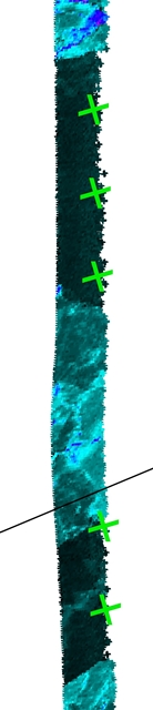
CryoSat crossing and a lead (green cross) visible in the airborne laser data
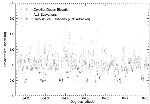
I finish with a remarkable illustration of the result. The plot at the top shows both laser height measurements from the airplane (the grey dots) and CryoSat data (the green and red crosses). The green crosses correspond to CryoSat measurements of sea ice and red crosses areas of thin ice or open water (called leads).
Notice how the laser measurement 10–20 cm ‘hover’ above the CryoSat green crosses. The difference is most likely due to a layer of snow lying on top of the sea ice. The laser bounces of this surface whereas the CryoSat radar signal penetrates deeper into the snowpack and, hence, gives a lower reading. By carefully studying these differences scientists are not only able to determine the amount of snow on the ice, which could be interesting for climate studies for instance, but also make adjustments in the CryoSat data to improve the accuracy of the thickness maps it generates. Studying these differences and ensuring that the maps are accurate is at the core of CryoSat validation activities.
Even more interestingly perhaps, notice the difference between the CryoSat radar echoes on sea ice (green crosses) and thin ice or water (red crosses). These are only 20 cm apart yet CryoSat is able to detect the difference 700 km away. Since the 20 cm represent the height of the ice above water, and knowing that for floating ice about 9/10ths of the ice lies below water, we now know thanks to all the efforts that the ice thickness on that day and along this particular track was approximately 2 metres thick.
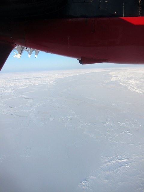
Lead in the sea ice seen from the aircraft
Discussion: no comments