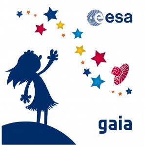
 Three months before the start of the launch campaign we had to define the logo to be put on the launcher fairing, to ensure it would be ready for launch. Earlier this year we had already put in place the main characteristics of the Gaia logo: stars, Earth, spacecraft, the Gaia goddess and Gaia name. But one of the main themes we wanted to represent is humankind’s curiosity towards the Universe. Quickly, different options were ready. Christophe, our graphic designer at ESTEC, came up with a very nice representation of the Milky Way. Elizabeth, from Toulouse, suggested that the girl staring at the sky should be trying to reach it. However, the presentation of the girl, the Gaia goddess linking Earth with the sky and stars, was difficult. Several options were proposed but it was difficult to get everyone to agree.
 Having recently seen the final work of Joël Schopfer (the nephew of Ared) finishing graphic art studies in Switzerland, we informed him of this issue. Joël is a fan of all sorts of things related to space and was very enthusiastic to contribute his ideas. When he presented his proposal it was clear that this was the one we would go for.
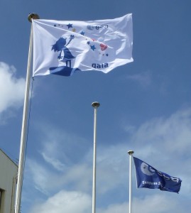
After scrutiny and agreement inside ESA, here we are in the space centre at Kourou, soon ready for launch with a superb logo for our fairing, measuring 3.5m x 3.5m! We also have smaller sizes and it even appears on flags at the entrance of the base and next to the building where Gaia is located. Last week it also appeared on T-shirts.
Thanks to all those who helped to solve one of the numerous issues that Gaia encountered during its life on Earth.


Discussion: no comments